
Before there was a website, a team or even a single chiller on hire, there was a blank page and a question: what should Celsius Hire actually look like?
We recently dug back through our archive and found some of the very first logo concepts, sent over before the company had even launched. Seeing them again reminded us how much thought went into that little “C” you now see on our vans, our buildings and yes, even our mugs. So we thought it was worth sharing the story of how it came to be.
The early concepts
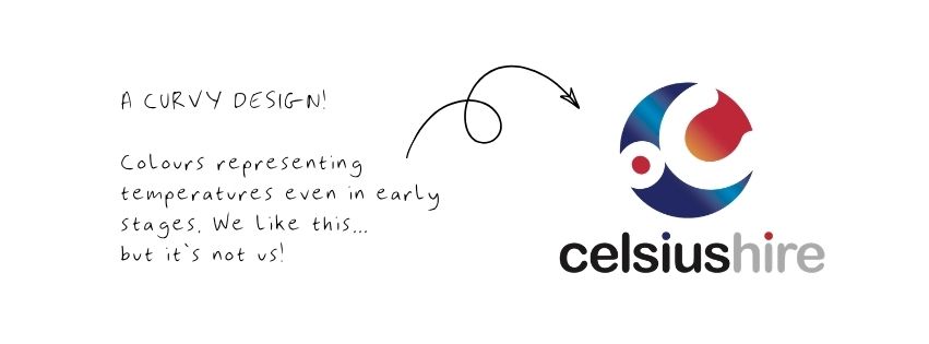
The first rounds of designs explored that balance in a few different directions. Some leaned into a bold, angular “C” shape. Others played with a more rounded, orbit-like form, with the “C” wrapping around itself almost like a sun or a dial, hinting at temperature and control. In every version, the wordmark sat right alongside it, so the design always read as one complete identity rather than a symbol with a name bolted on.
At this stage, colours and fonts were treated as flexible. As our designer put it at the time, there was no point getting too attached to a font or a shade of blue this early on, since those things can always be tweaked later. The priority was getting the balance between the symbol and the name right first and building outward from there.
Landing on the “C”
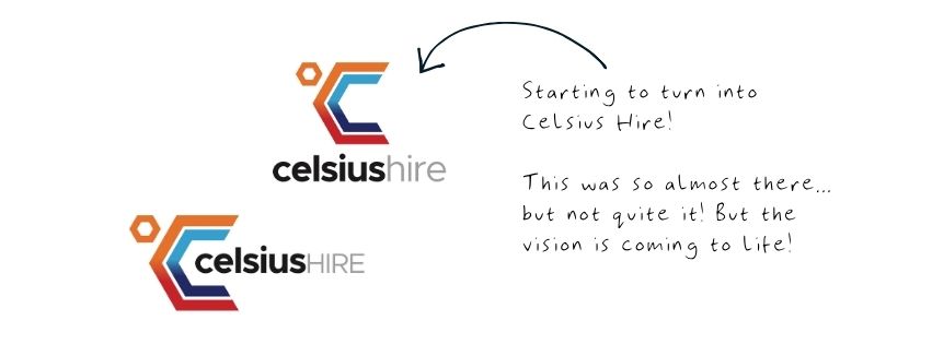
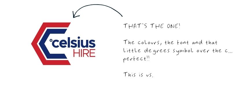
Out of those early rounds came the shape you will recognise today: two angled strokes forming a “C”, with a small hexagon sitting just above it like a degree symbol, a subtle nod to “Celsius” itself. It is a clever bit of design, since the hexagon does double duty as both a temperature marker and a distinctive brand detail nobody else in our industry has.
The gradient running through the “C”, moving from warm orange and red into cool blue and navy, was a deliberate choice too. It represents exactly what we do: heating on one side, cooling on the other, meeting in the middle.
Growing into a full identity
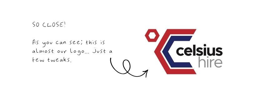
From there, the logo evolved from a standalone symbol into a full lockup, with “celsius” in bold black and “hire” in a lighter grey alongside it. Different weightings and layouts were tested (symbol above the wordmark, symbol beside it, wordmark on its own) to make sure it worked everywhere it needed to: business cards, signage, email footers and eventually a website.
Watching the vision come to life
For our directors, this process was never just a design exercise ticked off a to-do list. From those first rough sketches through to seeing the finished “C” on the side of a chiller, boiler or van for the first time, it has been a genuinely enjoyable part of building this company. There is something special about starting with nothing more than an idea on a page and watching it turn into something people recognise on the road, on site and now online.
That enthusiasm has carried through into every stage of the brand since, including the recent website redesign. (COMING SOON)!
Our directors have stayed closely involved throughout, and it shows in the little details: the colours, the imagery, the personal touches that make the site feel unmistakably like us. Seeing the vision they had right at the start finally come together across the whole business has been one of the most rewarding parts of this journey.
Why it still works today
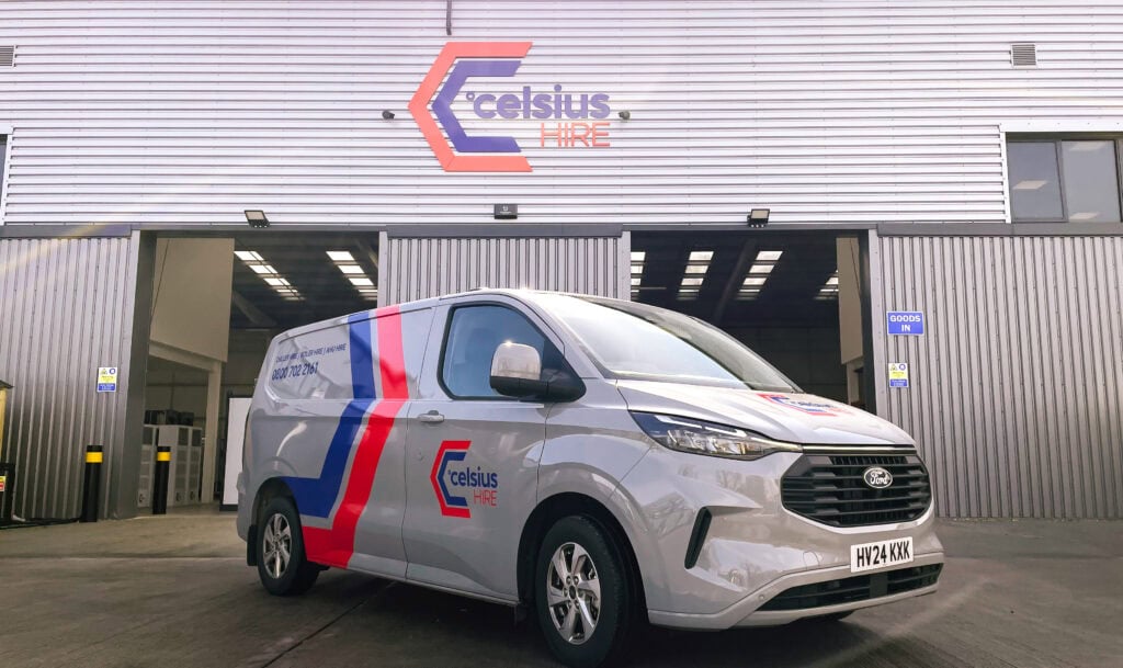
Fast forward to now, and that same “C” is doing exactly the job it was designed to do all those years ago. It is on the side of our vans, on the front of our depots, on our mugs in the office kitchen and now and our website. Whether someone sees the full logo or just the symbol on its own, they know it is us.
That original goal of building a mark strong enough to stand alone has genuinely paid off and it has also shaped a lot of the thinking behind our new website. Which you’ll see exactly how that has come together VERY soon! You’ll see just how much our logo has driven the overall look of the website.
It is a nice reminder that good branding is not something you rush.
It takes a few rounds, a bit of patience and a designer willing to keep tweaking until it is right.
Looking back at where it started, we are pretty pleased with where it has ended up.
